
25 September 2011

⌘I

Inverted values: Le Labo for Anthropologie Concrete Perfume packaging. I wonder if the concept of antique "measuring weights" was decided on before or after this was actually designed. Emphasizing the weight instead of the logo already speaks to an apothecary aesthetic -- was that alone not conceptual enough? Brings up interesting questions of concept and execution, I think. Also, probably wouldn't work without Grasse -- New York, even if they are an anti-brand. Altogether pretty packaging reminds me of other fave perfume solid -- In Fiore.

1961

From a 1961 issue of Holiday picked up recently at the Magazine.

01 September 2011

16 August 2011

D/REAMS


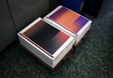
Marbled ream paper project realized by Glasgow-based artist Tom Godfrey. On Tom's site I also found a link to another interesting project called pyramidd.biz for which he has created one of the monthly backgrounds. Reams pictured in collaboration with (from top) Matt Jamieson, David Osbaldeston, and Sean Edwards.

10 August 2011

MYTH

Maurizio Anzeri, from the Photographer's Gallery in London. Photos found here.

YES


From the Shoreditch Department of Advertising Correction. I really despise most advertising, so naturally I think this is great. Found here, via here.

30 July 2011

FLAT & NOT FLAT

I've always liked this cover by Alvin Lustig. Its flat patchwork is offset by the incorporated type. Also I think it's impossible not to like vintage handwriting. Interesting how handwriting trends change, no? 

26 July 2011

TODAY

On the way to a dinner in Wood Green.

PHONE PICS


Sometimes I don't have my camera with me so take photos on my phone. I never bothered to get them onto my computer until now. I like the film still effect. Bottom from F. Scott Fitzgerald's Tender is the Night, hardbound Penguin edition designed by Coralie Bickford-Smith, spotted at a party recently ...

22 July 2011

MUNICH


YEP


MATH

From my MA work, Distillates Wallpapers on display at the Rochelle School. Photo by Siyu Chen.

12 July 2011

SMART


Images from 50yearstorm, a blog full of nice typography and tasteful babes. Not sure, I think dude made the illustrations. They rule. Typefaces from Andrew Woodhead, Paris-based typographer/designer, and BALTIC CENTRE for Contemporary Art in Newcastle, UK.

09 July 2011

MICRO


Grains of sand photographed by Gary Greenberg. Sent to me by a friend, found here.

07 July 2011

LUSH


Rhea Thierstein is a London-based art director and set designer. The top photo is a work in progress Selfridge's window shot, from her blog. Makes me think of hand-dyed silk. Above photo from an Italian Vogue photoshoot shot by Tim Walker. I love how Laura Ashley it feels. Found via here.

HYDE PARK

Picnic time.