

Showing posts with label PACKAGING. Show all posts
Showing posts with label PACKAGING. Show all posts
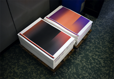
05 June 2013
07 December 2011

03 December 2011

12 November 2011
WRAPPED

Artist monograph designed by M/M (Paris) for Koo Jeong-A. I like how it's fully wrapped with a photograph of forest -- something hidden and exposed all at once. Even the name wraps it up.
01 October 2011


25 September 2011
⌘I

14 May 2011
SMALL TIME


Love this product packaging found at Old Faithful Shop. Top: D.S. & Durga; bottom: Bonnie's Jams. When I checked out Bonnie's site, I found this great quote on her blog: "Like most people in business, I think about branding. So I was struck by Osama’s cave and hills branding strategy. In fact he lived in a villa with all the usual comforts." Tying into this, earlier this morning I happened to read an article from last year about Andy Spade: "'The bigger you get, the smaller you act.' [ie] The more personal a brand, the more stuff it can sell." Great news, but frankly I think I prefer the idea of business growing while keeping true to themselves rather than becoming big and then 'down branding'. Bonne Maman is a great example of this, have they ever changed their packaging? I don't think so.
16 March 2011

14 March 2011

23 February 2011


13 January 2011
HMMM...

12 January 2011
ILFORD

Recently in a discussion with designer Christian Küsters, he brought up the point that design doesn't always have to be classic -- that one should be able to look at something and know exactly what era it's from. That idea definitely takes the pressure off of trying to make design 'timeless' all the time. Because really, is something actually timeless, or is it just so neutral that it never goes out of style?
11 November 2010
BOXES

17 May 2010
THEME AND VARIATION


A battalion of zebra and mint make up Claridge's rebrand, brought to you by Construct here in London. Love the theme and variation stripes. Found on CR blog.
Subscribe to:
Posts (Atom)