

31 January 2011
COLOR
15 January 2011
DEERHOOF

The Forbidden Fruits
Desapareceré
Top Tim Rubies
13 January 2011
HMMM...

12 January 2011
META

ILFORD

Recently in a discussion with designer Christian Küsters, he brought up the point that design doesn't always have to be classic -- that one should be able to look at something and know exactly what era it's from. That idea definitely takes the pressure off of trying to make design 'timeless' all the time. Because really, is something actually timeless, or is it just so neutral that it never goes out of style?
ROLL & HILL

RIKA MAGAZINE
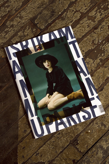
Frankly, I'm not *that* into model culture -- what I find interesting about this is the use of photo-on-photo. Last year a lot of my work utilized this effect and this seems to be a perfect example of collective consciousness (if we want to call it that). People in two separate places in the world creating the same type of work independently from one another -- I guess it's responding to the same stimulus in the exact same way, creating a movement of sorts. Too bad the wiki page on collective consciousness doesn't give us much to go on... maybe a good topic for a psychology MA.
Anyway, I like this cover. Image found here.
HAPPY NEW YEAR


10 January 2011
1972


 Was just watching Woody Allen's Play It Again Sam, a film from 1972 set in San Francisco. The interiors feel kind of familiar, I guess it's the California vibe coming through. I'm trying to imagine the reception of the same poster if it were designed today -- love the cut out silhouette mixed with the super 70s style drawing.
Subscribe to:
Posts (Atom)